Week 15: Post-Final Feedback

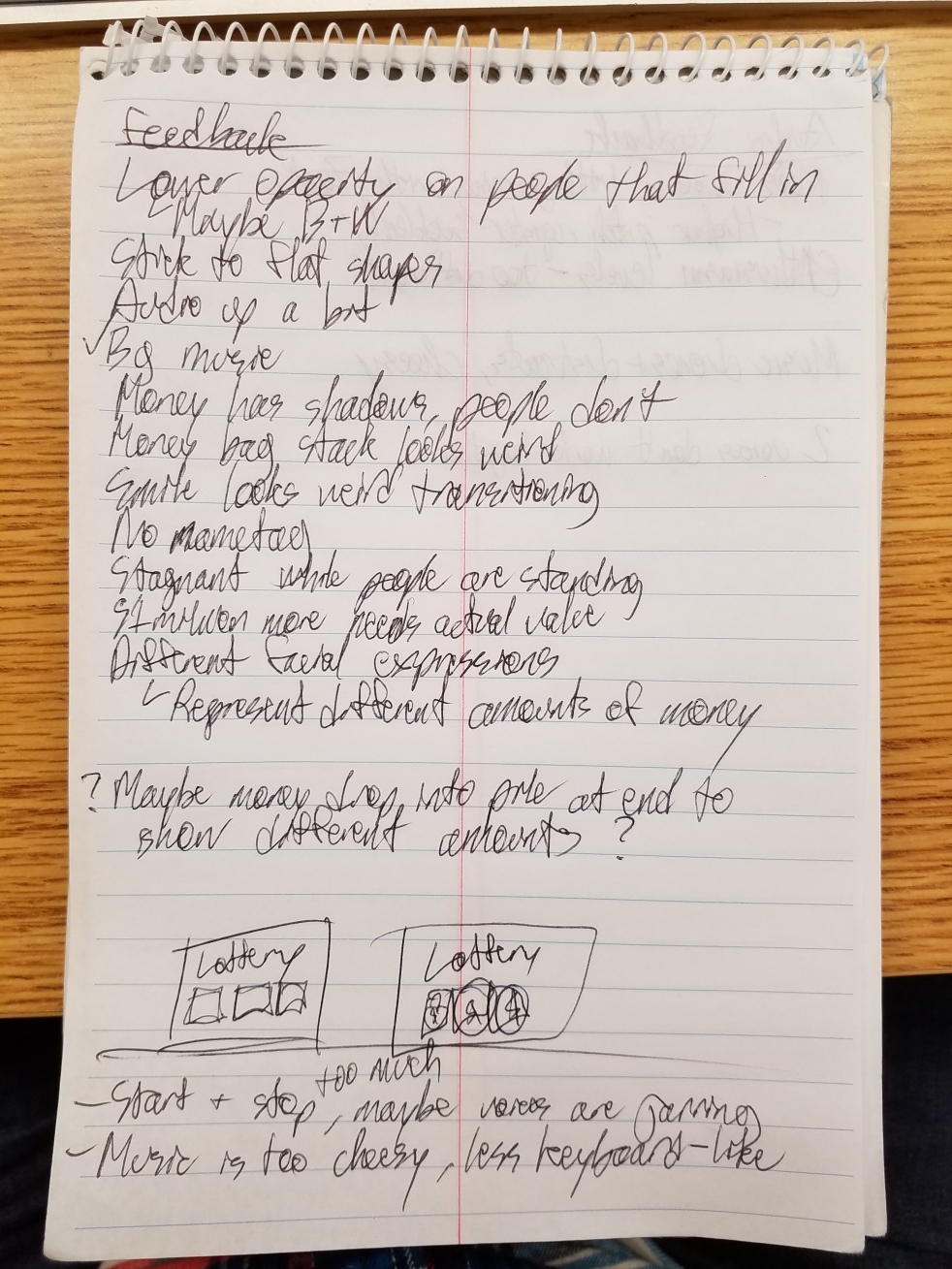
We did it, we showed our video to the class.  Because Kae and I are known to be particularly active when it comes to giving feedback, Pannafino had the entire class go person-by-person to make sure everyone gave feedback to us, instead of just waiting for raised hands.  So we got a lot of feedback, but none that I disagree with, so that’s a good sign.  Here it is for grading and posterity purposes, or if we ever felt like going back to fix them for kicks:


2 different yellows that are close but not quite the same are on the screen at the same time (Construction hat and money bags) so it looks a bit odd.

The font choice was odd, it was very serif and serious looking, but the video is very cartoony and simple. It makes sense because the font represented money, but it kind of clashes with the whole style.

Character Illustrations could have been better. The lines and shapes looked a little rushed ad could have maybe benefitted from more detail.  It wasn’t a clashing of styles, but just a whole aesthetic level that felt a bit underwhelming.

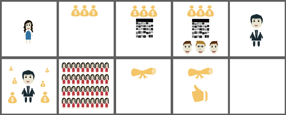
The “graphs” showing income level may need to be tweaked for accuracy.  The college grad is making double, but it looks more like he just has a quarter higher when standing next to the other two.

The backgrounds are a bit too strong.  Sometimes the colors of the objects (such as the blues in the pants and shirts) blend into the background and get a little lost.

In most cases we didn’t “create an environment”. We had objects on a screen, but didn’t have a whole setting or environment for it to take place in.  Kind of feels empty and plain.

The color palette leant a little too much on the primary colors, and could have benefitted from some subtle gradients or textures to make them stand out a little more or “feel” good

There is an inconsistency with illustrations and objects, some have strokes and some don’t.

The rich guy that is used at the beginning and the end could have used more color or contrast, he’s mostly in a black suit and has some trouble standing out at times.

The examples of billionaires (Steve Jobs, Bill Gates, Mark Zuckerberg) that we used at the beginning feel a bit stylistically odd.  They don’t completely fit in, maybe since they don’t have bodies and everyone else does? The level of detail is also a bit off compared to the other figures.

The calendar doesn’t look like a calendar.

The globe stays up a bit too long at the end.  I timed it to fade out with the music, but it does feel like it hovers up there just a touch too long.

The opacity use is solid.  Looks good, easy to read, communicates what it needs to.


All in all, it’s a pretty solid work that I would feel comfortable with displaying as a portfolio piece, and I’m pleased with what I learned in the class as a whole.  Let’s see where the world takes me next.

Week 15: Final Video

Here is the final project with integrated feedback:

Thanks to our classmates for constructive feedback and enduring this project with us, thanks to the Comm students for their audio work, and thanks to Professor Pannafino for the supervision, education, and leadership.  We hope you enjoy it.

Week 14 Outside of Class

Well here it is, a full run-through of the video:

We’ve taken the feedback from the professor and our other students and have made an explainer video that we think meets and exceeds the requirements of the project.  It has changed a good bit since our original conception and storyboards, but it has become a project that cleanly and succinctly explains the concept we chose. The recording and soundtrack from or COMM students turned out pretty well and really brings the project together.

The files that the comm student sent over included sound effects and other noises, which were appreciated.  I tried them out in the video but they felt kind of weird and took away from the narration a bit, so I decided to leave them out, but I’d still like to give a shout-out for them making/finding the assets:

soundfx

I plan to get feedback and make some changes one more time in order to make sure the video does everything we want, but here is a complete run through.

Week 14B

75% Animation

We are still discussing the sequence for the part with job employment statistics, so that is not final and subject to change, nevertheless here is the progress so far for posterity.  We now just have a few seconds at the very beginning and just a little more than a smidgen at the end, to use technical terms.

At this point animating the final sequences won’t take too long, and I anticipate most of the work to be in re-syncing it up with the finished audio once we have all that sorted out, and then making minor changes.  A lot of it is just subtle movement and little details to keep the eye engaged, so I plan to work on those over the weekend, I’d like the piece to feel a little more alive. But first, finishing the bare minimum, most important above all else.

During Class I was continuing to work on assets and making sure that they are consistent with a style that we were going for. Here is what I have changed so far.

The Lottery Ticket:

First render: absolutely horrible, and that’s putting it nicely. Here’s what it looked like.

Second render: much better, matches the style better, subtle gradients give off that illusion of a 3D scratch off effect.

There were some variations that I tried:

I was messing with the color of the text and the strength of the gradients. I chose these colors because we have used them before in the color of the money bags, and green typically symbolizes money.

Here is what the lottery ticket will look like after it gets scratched off:

Screen Shot 2017-05-03 at 12.42.49 PM

Another one of the assets that I revisited was the diploma.

1st render: not horrible, could have been better, doesn’t match the style.

Screen Shot 2017-05-03 at 1.43.43 PM

2nd time: more of a solid flat color style

I wasn’t sure what color to use, we decided that whatever color we make the grad cap at the end of the video, we will make the diploma that color too.

Screen Shot 2017-05-03 at 1.47.25 PMScreen Shot 2017-05-03 at 1.47.37 PMScreen Shot 2017-05-03 at 1.47.43 PM

Another one of the assets that I made was the globe. Here is what it looks like.

We then decided to apply the same color concept to the asset that would appear right beside it on the screen, the Thumbs Up

1st render: not horrible, just doesn’t fit with the color scheme.

Screen Shot 2017-05-03 at 1.53.00 PM.png

2nd render: much better in terms of flat graphic and solid color.

Screen Shot 2017-05-03 at 1.55.27 PMScreen Shot 2017-05-03 at 1.55.35 PMScreen Shot 2017-05-03 at 1.58.03 PM

I liked these a lot better, but the problem was, I didn’t think we could represent something positively with the color red, so we won’t be using red for any of these graphics.

Screen Shot 2017-05-03 at 1.55.35 PMScreen Shot 2017-05-03 at 1.58.03 PMScreen Shot 2017-05-03 at 1.47.37 PMScreen Shot 2017-05-03 at 1.47.25 PM

Screen Shot 2017-05-03 at 2.01.04 PMScreen Shot 2017-05-03 at 2.01.13 PM

I repeated the blue and green colors used earlier to continue the consistency.

Screen Shot 2017-05-03 at 12.56.35 PM.png

With this scene, I wanted to see what the assets would look like together before we jumped right into AfterEffects. Here is what they look like together.

Screen Shot 2017-05-03 at 1.08.33 PM

For the color of the graduation caps in this scene, I wanted to pick a color that was complimentary and wouldn’t blend into the globe. I started with red, but I wanted to see what the other colors in our color scheme looked like.

Screen Shot 2017-05-03 at 1.10.14 PMScreen Shot 2017-05-03 at 1.11.00 PMScreen Shot 2017-05-03 at 1.11.34 PM


I also worked on creating an order and figuring out what all of our assets would look like next to each other, in more or less a storyboard.

Here is what that looks like.

Screen Shot 2017-05-03 at 2.15.56 PM.png

Week 14A

Today in class we showed our video in front of the whole class to get a collective student critique as well as professor comments, as compared to past times when it was a bit more individual. The critiques were largely helpful and definitely gave me stuff to work on without feeling to overwhelming in any way.

20170501_142111

Some of the stuff was planned already and I haven’t done it yet, but it’s still good to know that what I have left to add in as requested, so it defiantly has a purpose and will benefit the piece. In addition to these comments that I kind of knew about ahead of time, they did also include a few good comments to work off of, for both small as well as less small improvements.

Dr. Pannafino also listened to our new recorded voice over and gave us a good bit to work on with the COMM students, who we are meeting with tonight. All in all, helpful feedback and a little over a week to go.

Week 13 Outside of Class

Today the amount of the project that is due before class in time for peer feedback is around 60% completion, so a little over 30 seconds. For this portion I mostly focused on adding the next “set piece” section while fixing the backgrounds for previous ones. I still have more plans to go back and improve certain elements and assets from this portion, but I’ll probably finish a run through of the video first before making those relatively smaller adjustments. Certain movements and fun little details need to get added, so that’ll come after I finish the animation overall.

In addition, we recorded our voiceover with the COMM students and it sounds pretty legit, the studio recording set-up really does more for the voiceover than my desk mic did, and it’s nice to have a little background music.

Edit: After showing the video in class we got a fair bit of solid peer and professor feedback: stick to flat shapes with the assets, fine tune the audio track and certain elements respective to one another, add in some more little subtle animations and motions, and more clearly communicate some of the dollars and values.

We need to focus on making our assets more cohesive, working with flat objects and shapes of color will help us get in that direction. Getting rid of strokes on objects and maintaining a consistent color scheme will help that as well.

Lots of good feedback to take into account, time to add it all in and see what we get, we’re nearing the finish line at this point.

Week 13B

Today in class I continued working on different assets. When I talked to Zach he told me that he had a different vision for the lottery ticket which I liked a lot better. I also recognized that these lottery tickets do not match up with the rest of the visual style. Here are the assets that I created in class.

These assets would be used when the narrator is saying “Let’s face facts. You’ve got a better chance at winning the lottery than you do becoming a member of the billionaire dropout club.”

Here is a hand drawn version of what the animation should look like.


I also worked on continuing to illustrate and separate assets for another part of our script. Here is what I worked on.


These assets are to be used when the narrator is saying:

“In addition, the employment rate for people with bachelor’s degrees is 96% while the employment rate for people with high school diplomas is almost 10% lower at 88%.”

This is a hand drawn version of what the animation will look like.


Week 13A

We were instructed to meet with our COMM student audio people, so we managed to do that yesterday.  We got our audio recorded and they’re currently mixing and matching and such, I’m looking forward to seeing (read: hearing) the results.

We were also to get to ~25% on our animation. Here is that progress:

Week 12 Outside of Class

So far we have talked with our COMM students, but from a lack of replies we have been unable to meet with them yet. We are now planning to meet Monday night.

We have also worked on the assignment to get to ~20 percent of our animation.

This version features less featureless background and more hands!

Also, we worked on splitting up the assets so that importing them into after effects is easier for Zach to work with. I have the assets completed and up on the drive for the first half of our animation.

Here is just an example of some of the assets that I have split up for Zach: